
MetaBox
Branding & Packaging
Brief
Create branding, packaging, collateral documentation layout, and product poster for a metabollic rate measuring device.
The brand’s tone must be scientifically credible, appeal to medical professionals, and reflect that the product is user friendly, affordable, quick to use, and compact.
The goal of the brand is to communicate how easy it is for practitioners to integrate MetaBox into the existing vital sign suite.
Original Logo
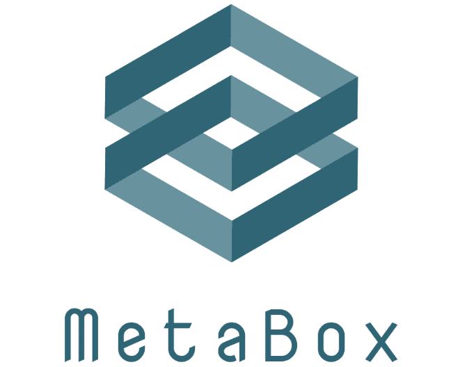
MetaBox’s original logo mark and type were geometric with a two-tone monochromatic color scheme.
Harsh corners and angled type makes this logo seem rigid which doesn’t communicate how easy it is to integrate the product into a practictioner’s existing vital sign suite.
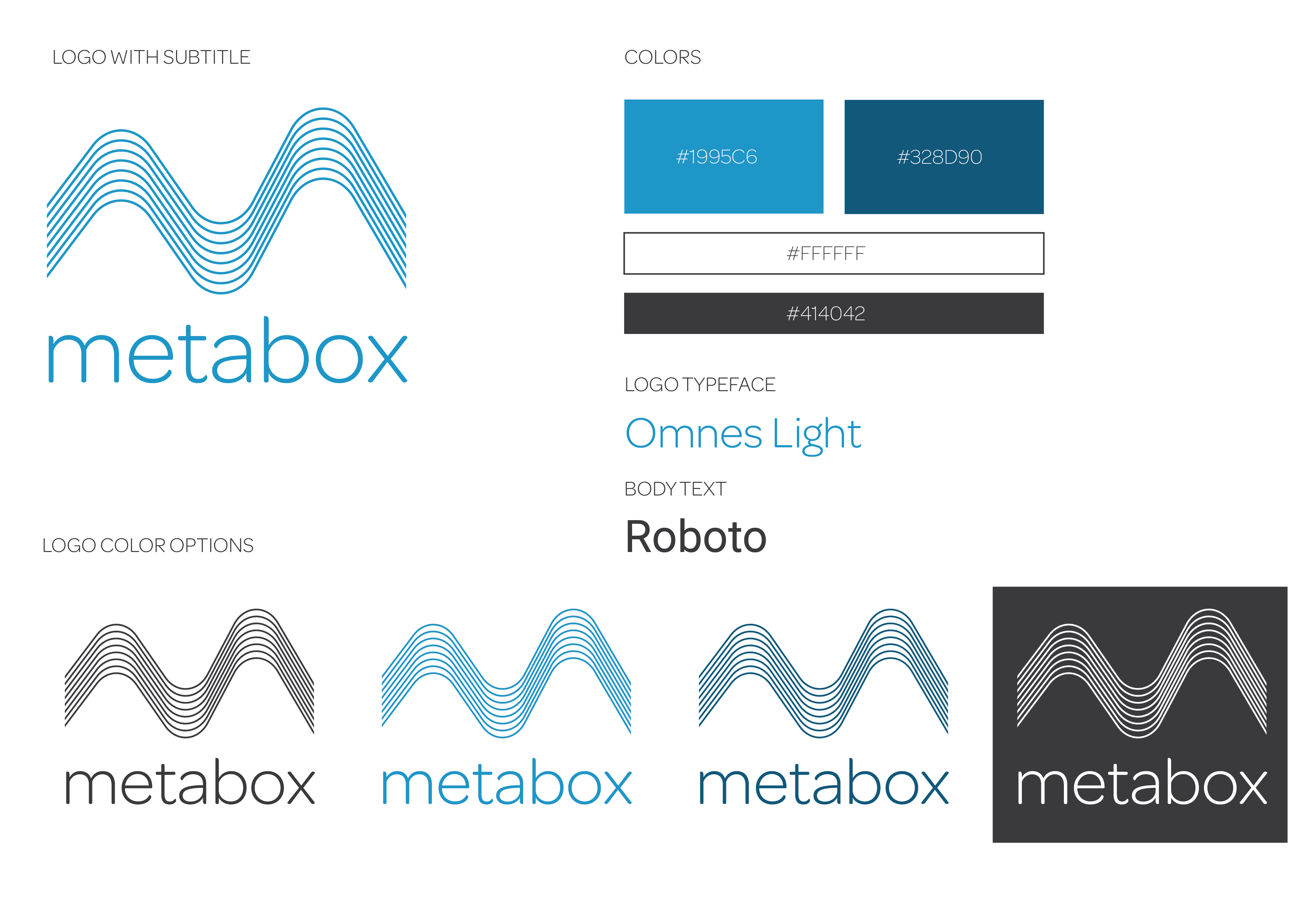
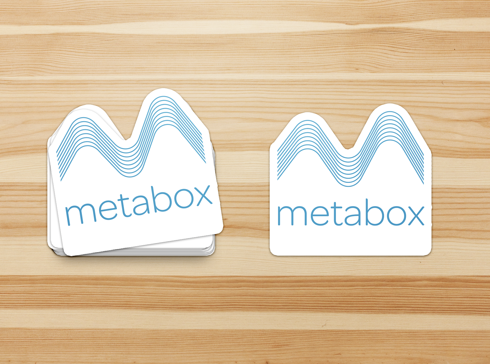
Graphic Standard
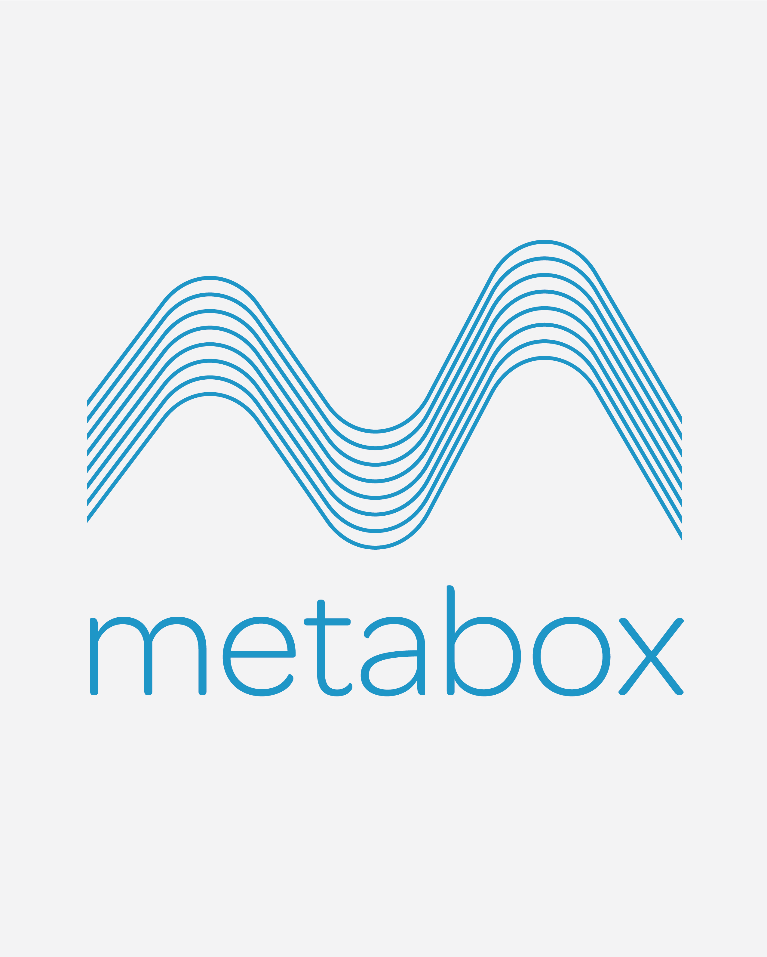
The updated MetaBox logo concept features more curves in the mark and typeface in order to appear more friendly.
The wave motif is used throughout the brand. It both mimics the shape of the letterform ‘m’ and the breath a user would blow through the device to collect their metabollic rate data.
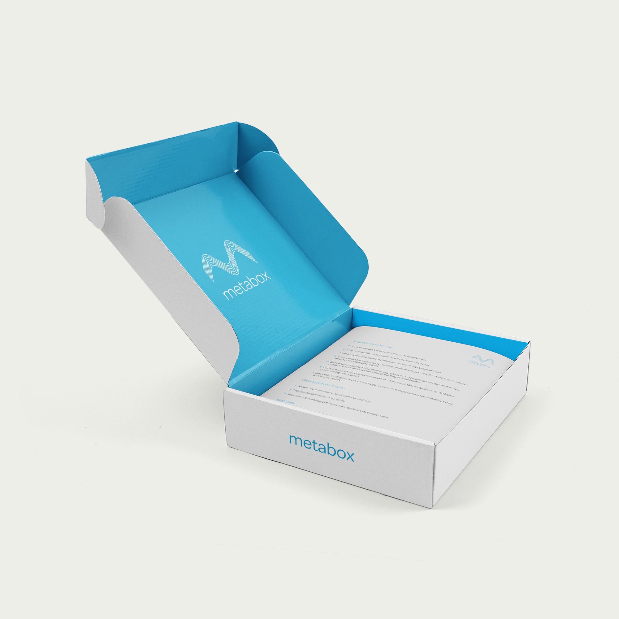
Packaging
Product packaging with instructions and proper FDA labeling.

Collateral
Hoodie sweatshirt and sticker designs.

Documentation Layout
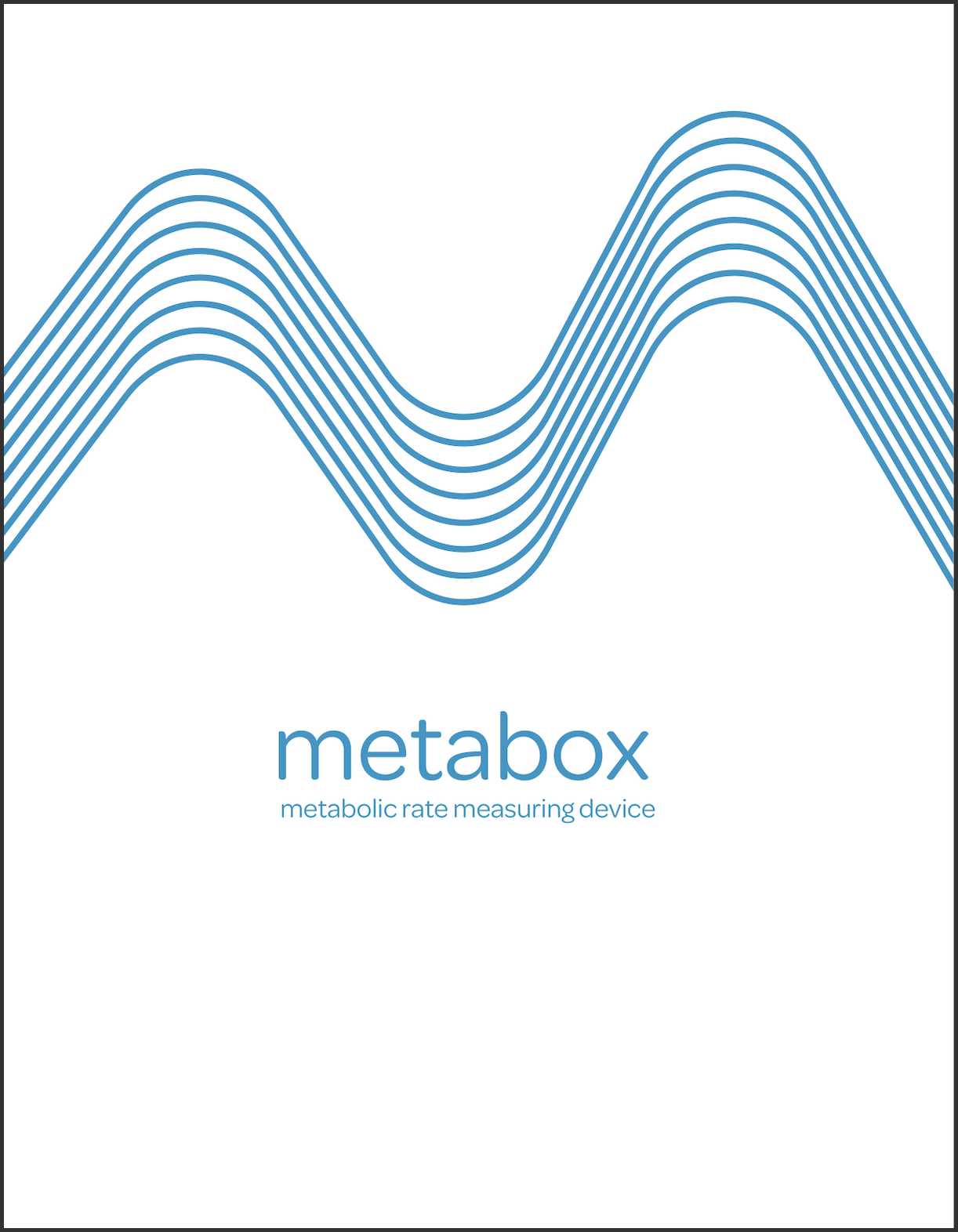
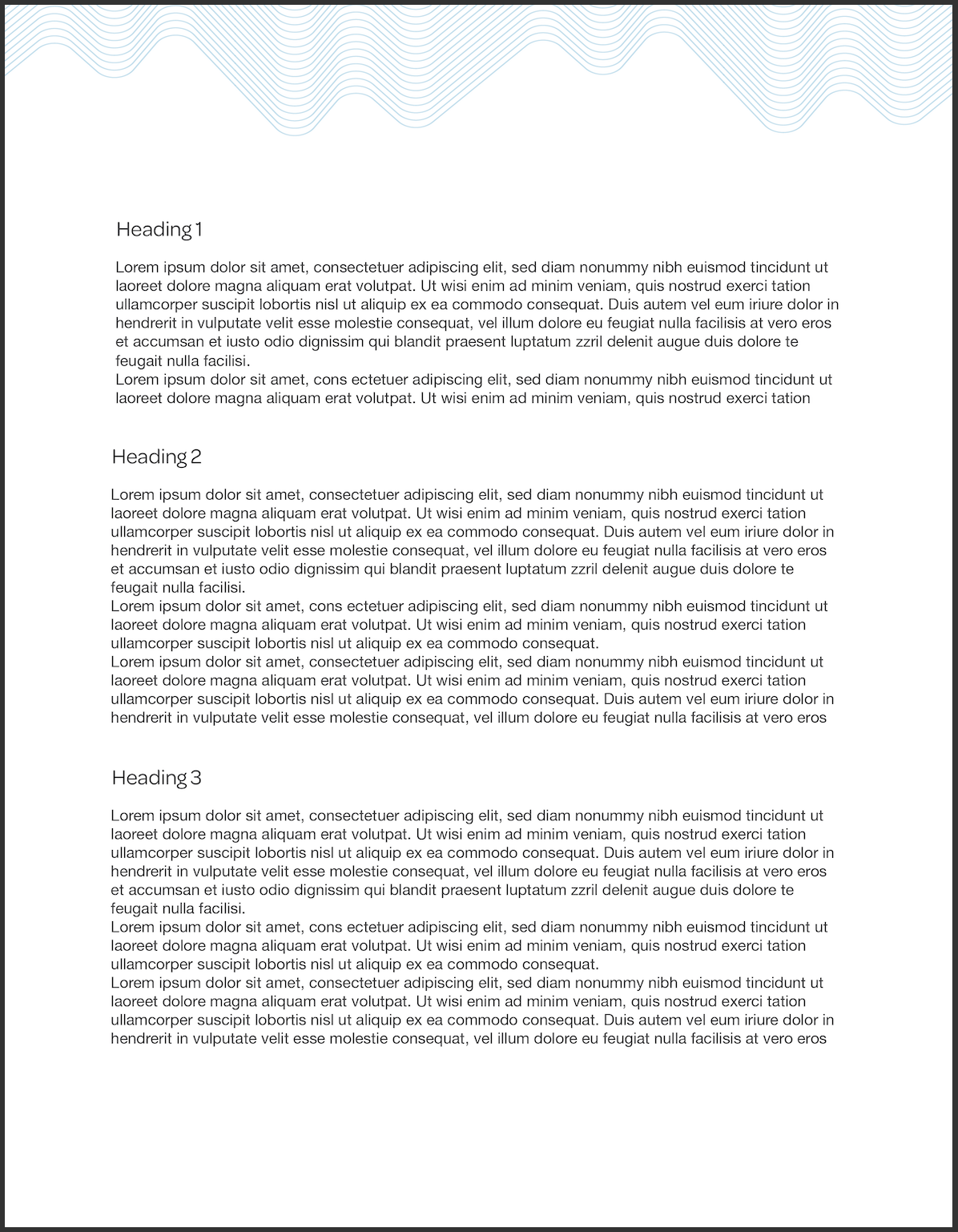
Report cover page and header designs.
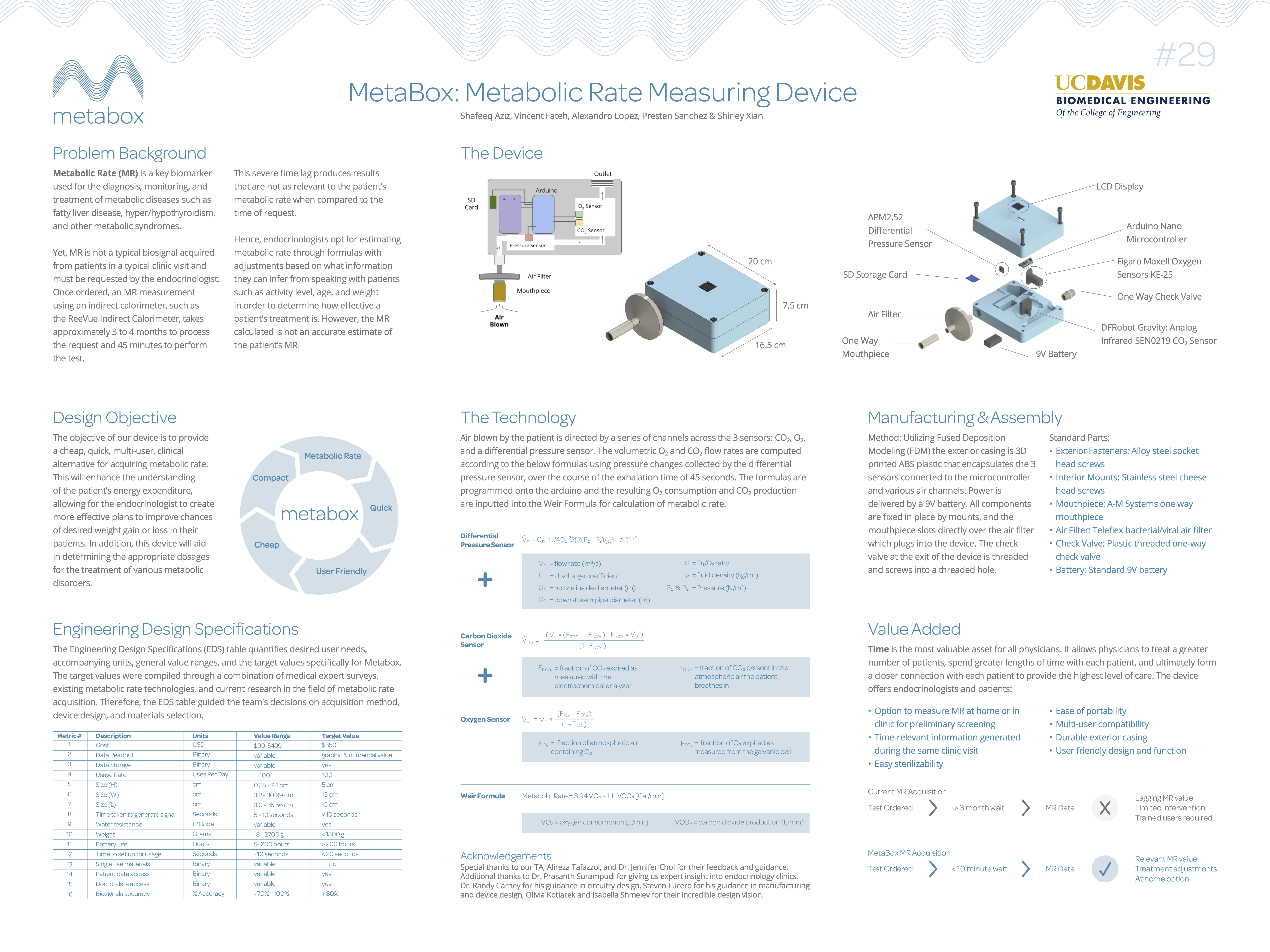
Product Poster
Poster outlining problem background, research, product technology, manufacturing considerations, and more.
My Role
I accomplished this project with partner Isabella Shmelev. I was responsible for the initial concept of the logo, font choice, cover page design, hoodie/sticker designs and the poster design. Isabella created the packaging mockup with correct FDA labeling, the header page design, and advanced the logo design refinement.